Implementing Features to Help Drive Conversions
Cruise Critic Mobile
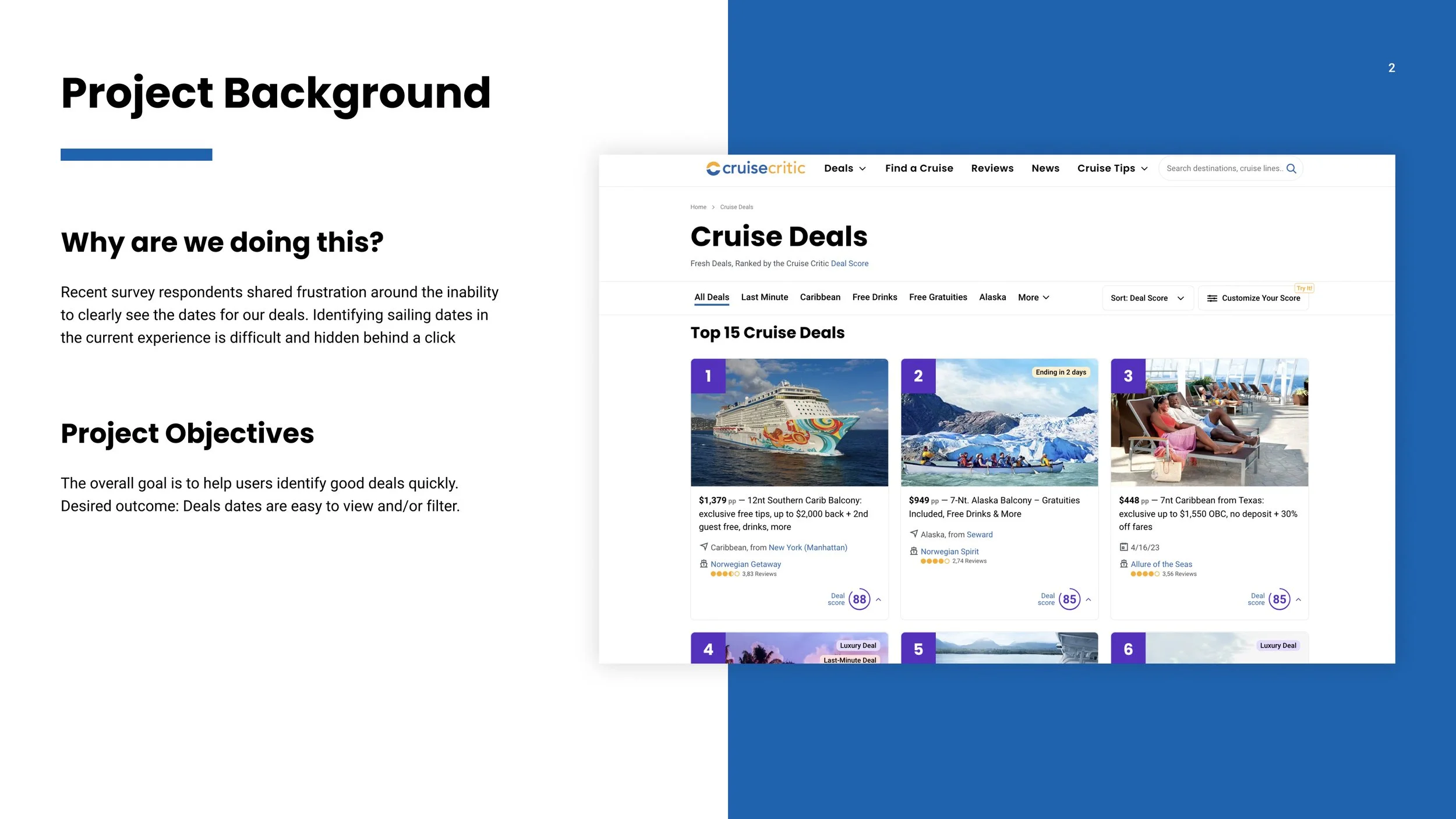
Background | Our “Why”
At Cruise Critic, we aimed to connect users with their perfect cruise. However, we noticed that our mobile experience wasn't up to par compared to larger screens. With a growing number of users researching on their phones, we recognized the need to not only improve the mobile web experience but also explore new features that could potentially be integrated into the desktop version. Our objective was to establish a user-friendly mobile platform enabling customers to effortlessly shop for cruises in both the "Find a Cruise" and "Deals" sections of our website. Ultimately, our goal was to enhance the shopping experience, leading to increased sales and conversions.
Impact & Outcomes
Through our concerted efforts, we introduced new features and capabilities to two of Cruise Critic's esteemed products. In the case of "Find-A-Cruise," we conceptualized five potentially transformative features, although they were temporarily placed in the backlog due to shifting priorities. Nevertheless, these features stand ready for deployment whenever the business is prepared to proceed.
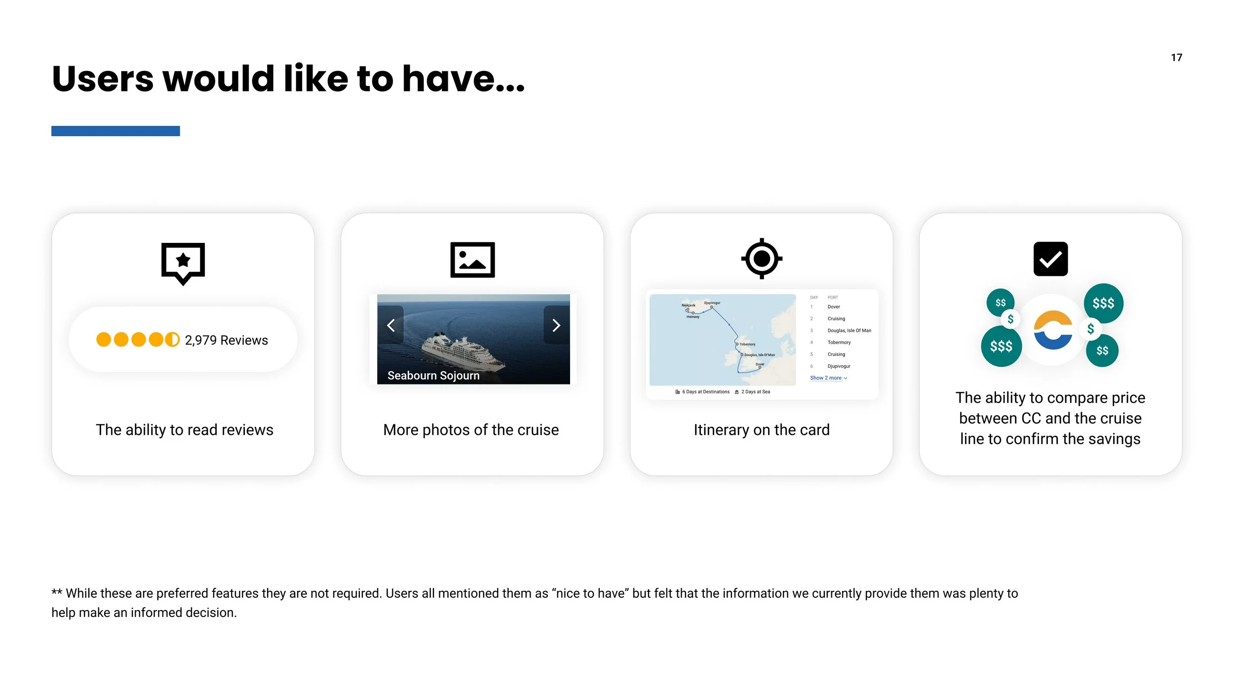
In the "Deals" product, one of Cruise Critic's latest ventures, we achieved a remarkable 30% increase in sales. This was driven by the successful implementation of enhanced filters and the innovative "Find Your Best Deal" feature. The introduction of the bottom drawer further improved usability, simplifying the comparison shopping process and presenting data on inclusions and bonus offers in a more digestible manner. These outcomes underscore the positive impact of our work on user engagement and sales performance within the "Deals" space.
User Surveys & Brainstorming
In collaboration with my project manager, I actively contributed to the ideation process throughout the sprint. Our focus was on enhancing the user experience and optimizing it for easier price shopping and comparison. We conducted surveys for both our "Deals" and "Find a Cruise" products, seeking user feedback on desired features. Insights from the "Deals" survey led to ideas such as refined filters and improved sailing information, notably the inclusion of sailing dates on Deals cards. For the "Find a Cruise" product, suggested enhancements included a calendar view with the lowest available price for each booking day, showcasing price differences between cabins, implementing a map with indicators for destination price values, optimizing the search bar and departing ports, and streamlining filters through an information architecture exercise to reduce cognitive load and aid consumers in making informed purchasing decisions.
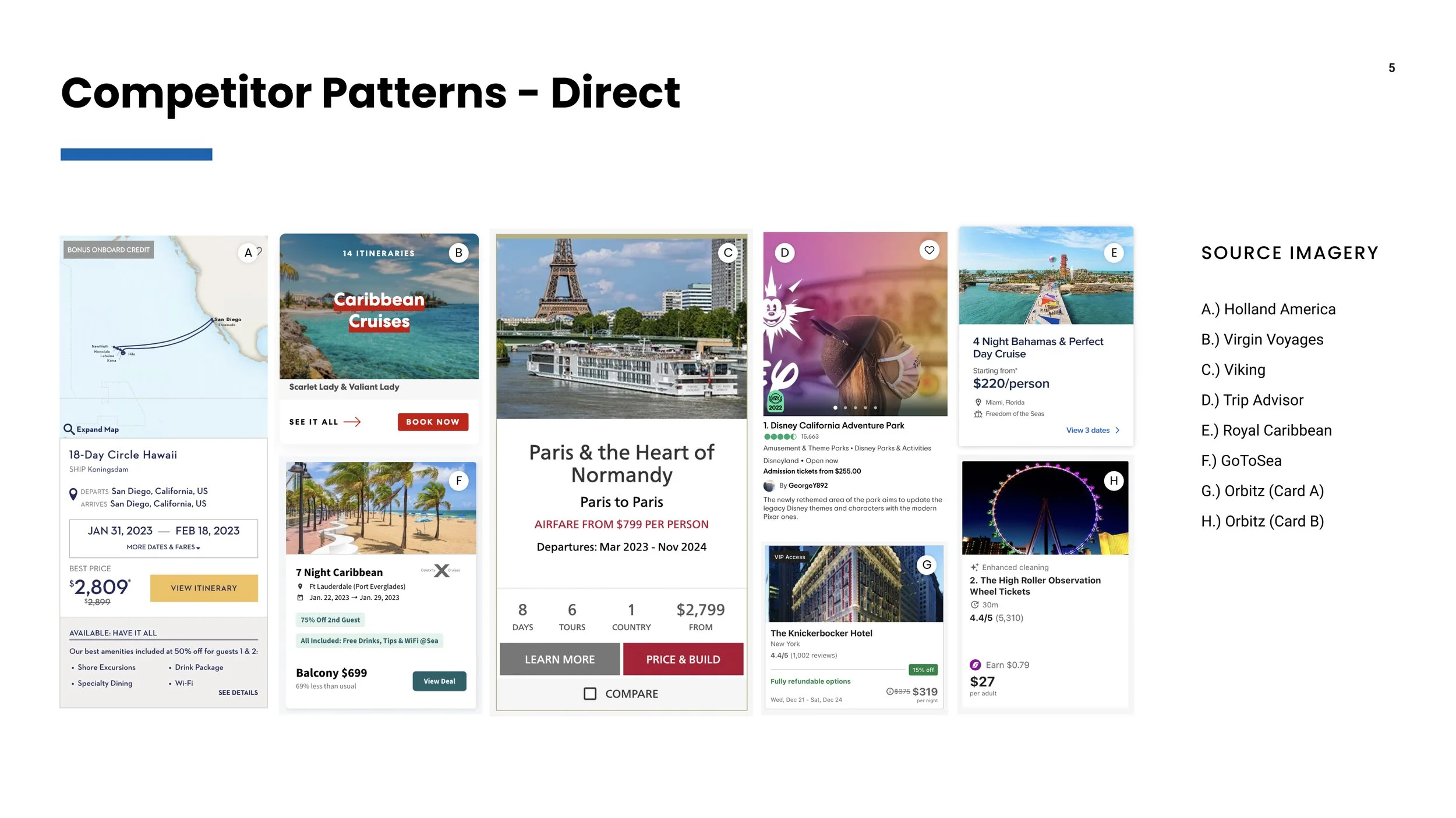
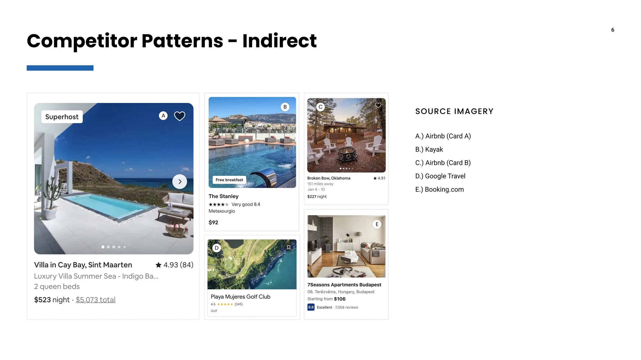
Inspiration from Competitors
After identifying potential features, I conducted a review of both direct and indirect competitors to understand how they implemented similar functionalities. The goal was to create relevant features for our platform while leveraging Jakob's Law to ensure a sense of familiarity for users based on their experiences on other websites. This approach aimed to strike a balance between innovation and user comfort, ensuring that our enhancements felt both fresh and intuitive.
Low-Fidelity
Without delay, I initiated the ideation process in Figma to create low-fidelity experiences for each identified feature. These served as conversation starters among the cross-functional leads, including myself, the project manager, and the tech lead. Given our small team, it was primarily our responsibility to proactively identify potential issues and develop solutions for A/B testing prototypes. This collaborative approach allowed us to efficiently iterate and refine our ideas before moving into more advanced stages of development.
“Find-a-Cruise”
Calendar Feature
“Find-a-Cruise”
Enhanced Search Bar
“Find-a-Cruise”
Map View for Departures & Destinations
High-Fidelity (Find-a-cruise)
Design concepts were crafted for a majority of the previously discussed features. However, these features are on hold as the business chose to prioritize deals features and other projects. The mature state of Find-a-Cruise led to the decision to delay implementing these new features, placing them in our backlog for potential future consideration.
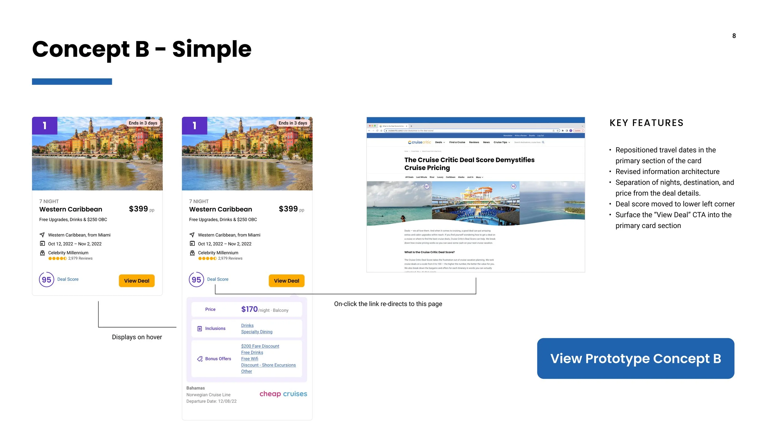
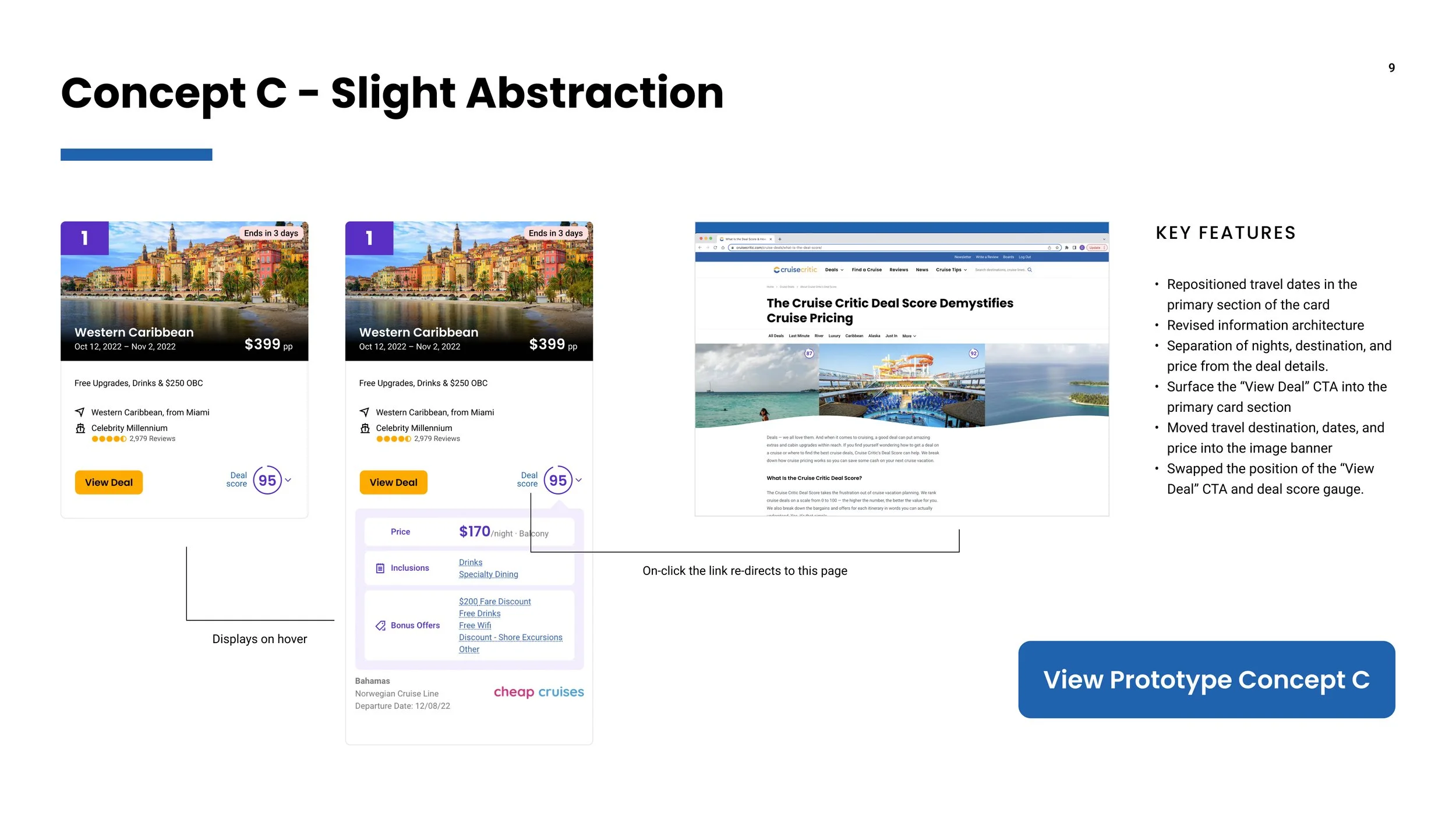
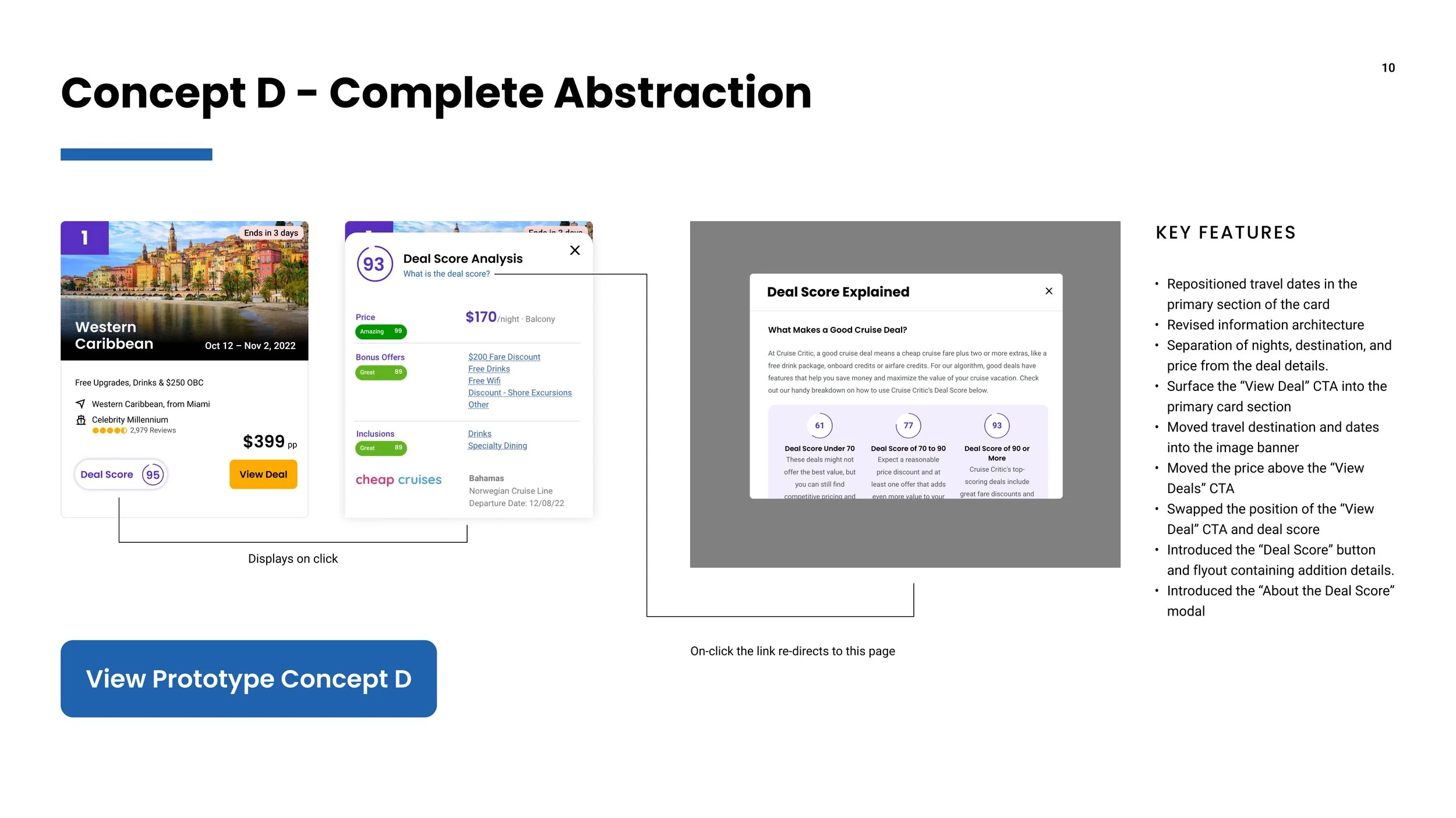
High-Fidelity (Deals)
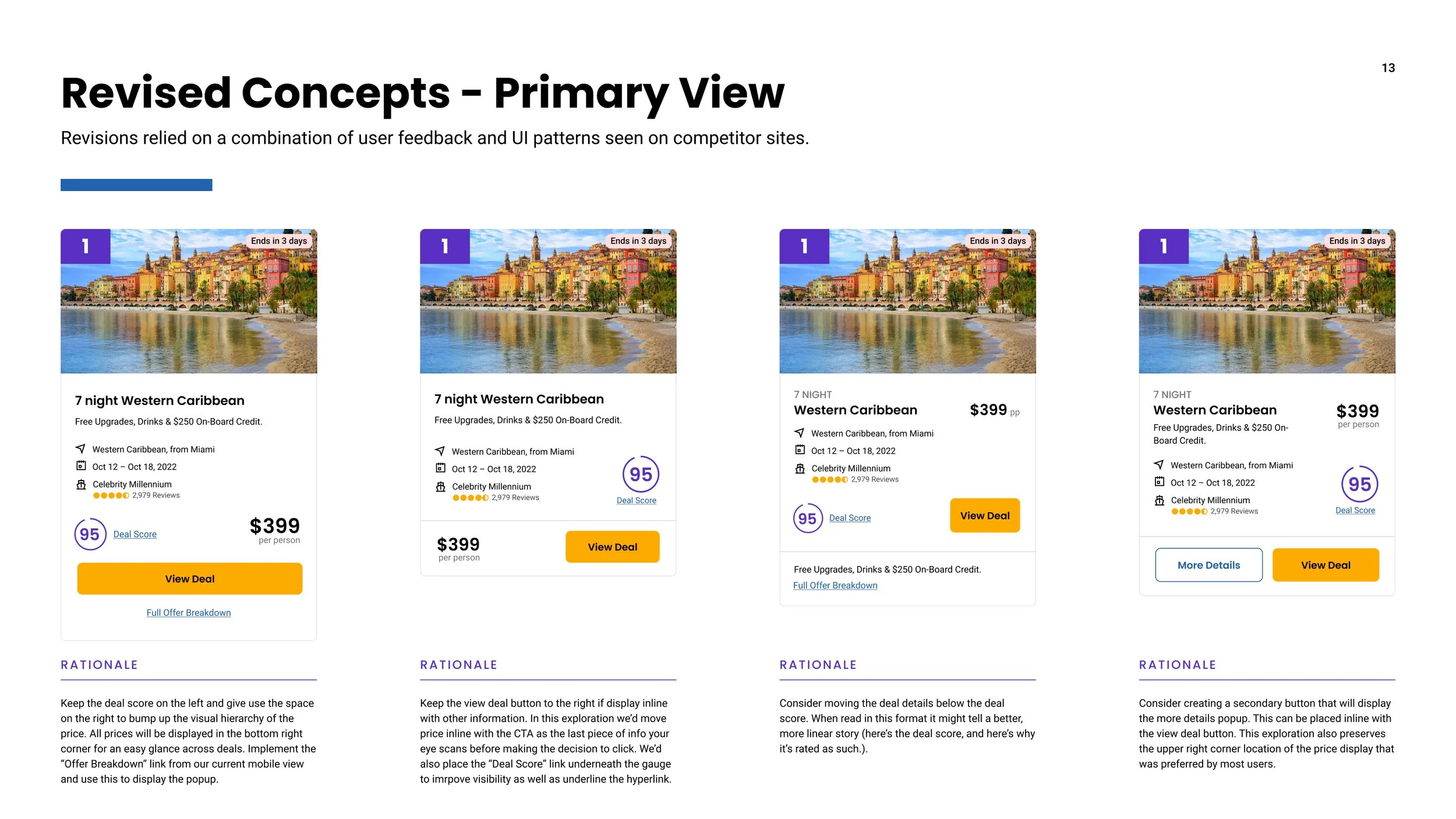
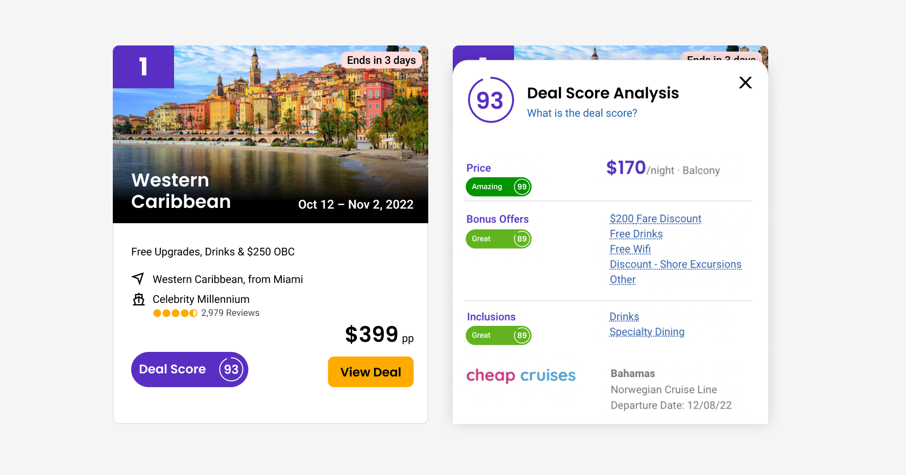
For the deals product, we underwent a design, testing, and implementation phase for both enhanced filters and an improved deal card. The customer initially sought to display the sailing date prominently, but recognizing existing usability issues, I suggested a more comprehensive solution. In the previous version, the sailing date was somewhat hidden below the fold, requiring users to hover (on desktop) or tap "View Details" (on mobile) to access crucial information. To address this, we introduced a bottom drawer component, replacing the cumbersome expand function on mobile and creating a dedicated space for additional visible cruise details without the need for scrolling. This redesign proved especially beneficial on desktop by eliminating the problematic hover state. Users appreciated the enhanced functionality, with some leveraging the drawer view to compare multiple deals simultaneously, prompting us to consider adding a "compare" feature to our backlog based on positive feedback.
Finalized Deals Cards
Clickable Prototypes
Finalized Deals Enhanced Sticky Filter Bars
Clickable Prototypes