Banking Without Opening the App
USAA Google Assistant
Background | Our “Why”
We aimed to revolutionize the banking experience by allowing users to complete simple actions seamlessly, without having to go through the rigor of manually opening an app.
As mobile platforms evolve, people seek to interact with services through their preferred channels. The industry's focus on personal assistants like Alexa, Siri, and Google Assistant for information provision is growing. Currently, USAA app users need to log in to access information. Through Android actions and slices, we explored the potential of a post-application world, driven by voice, to remain competitive and thrive in the emerging digital consumer ecosystem. The primary target aimed at interactions that were more "read-only" in nature.
Opportunity & Outcomes
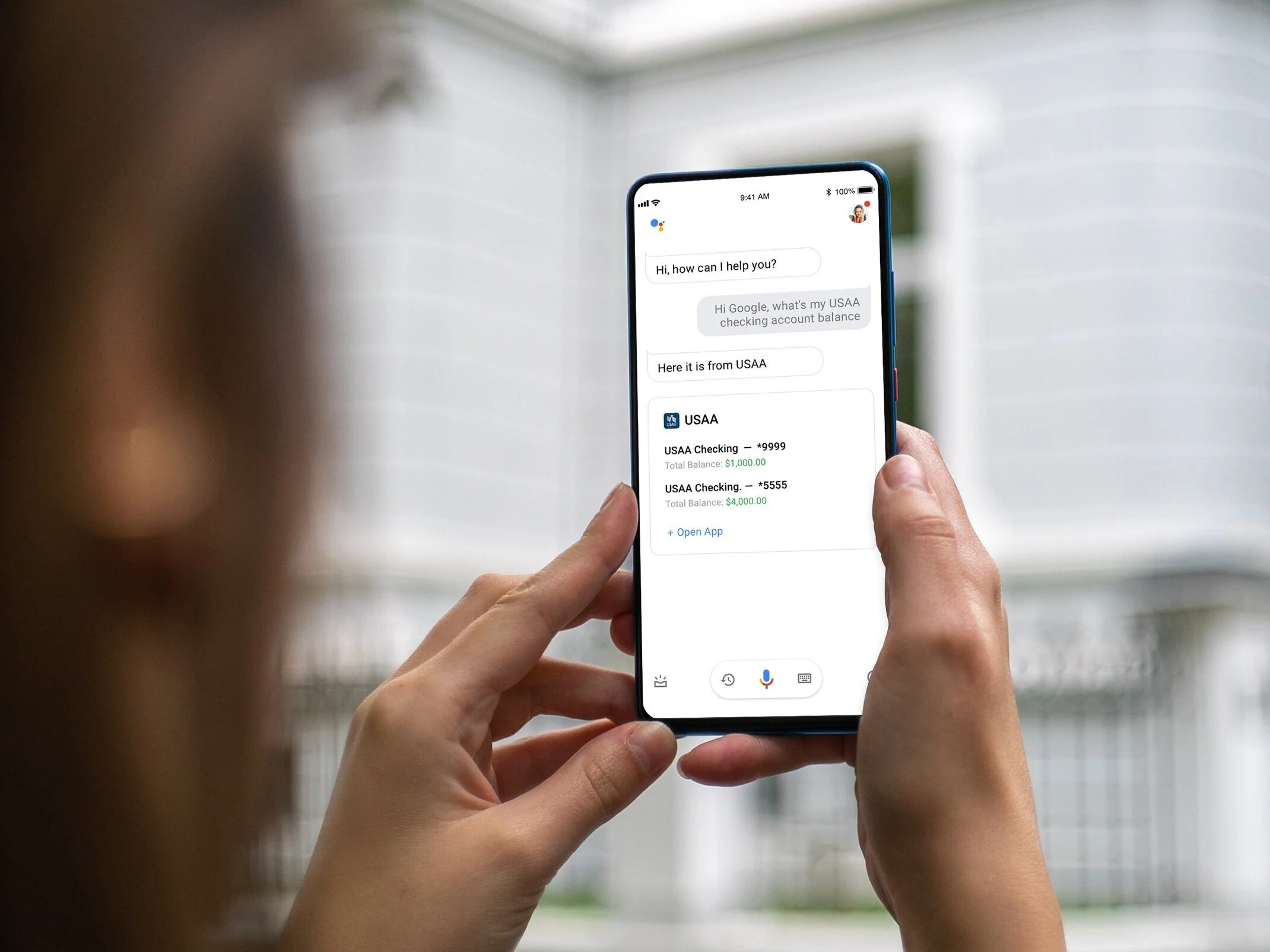
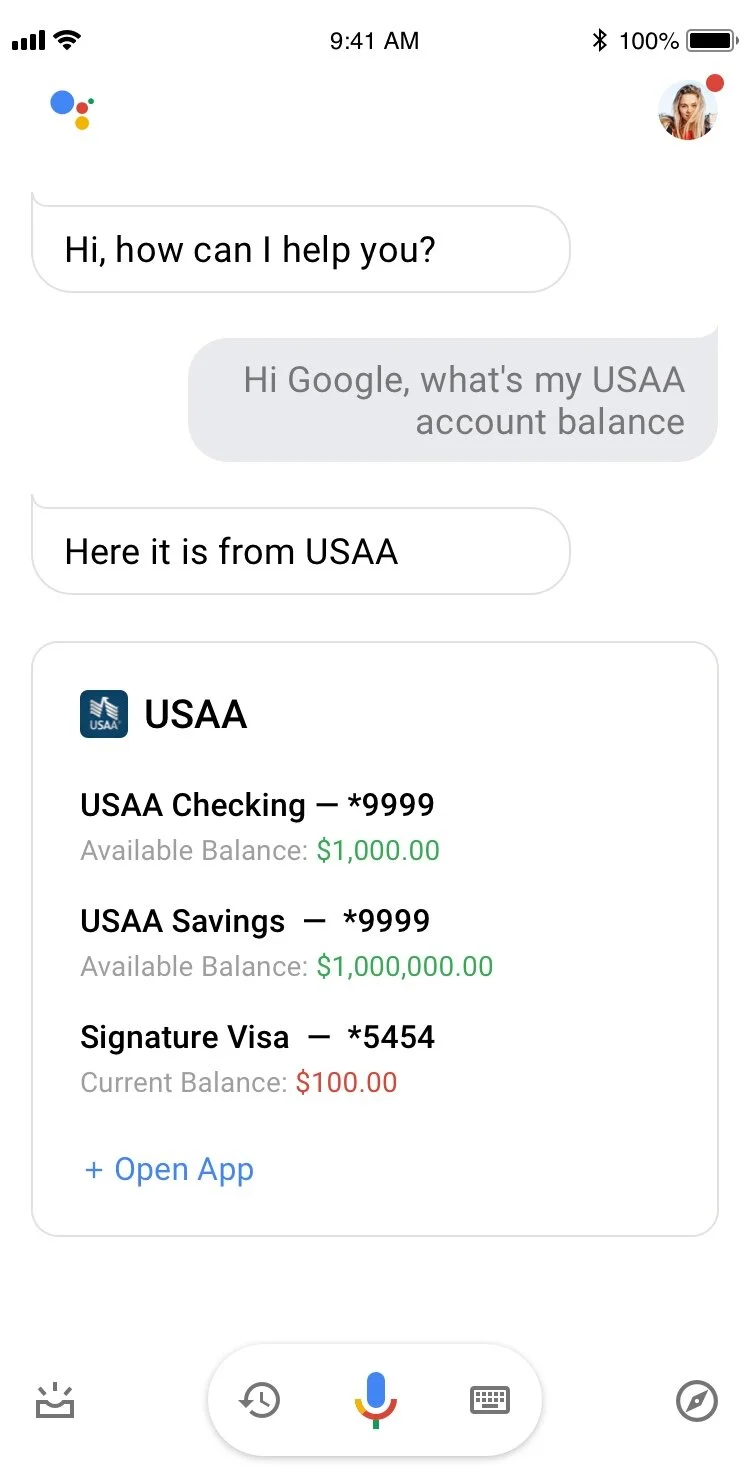
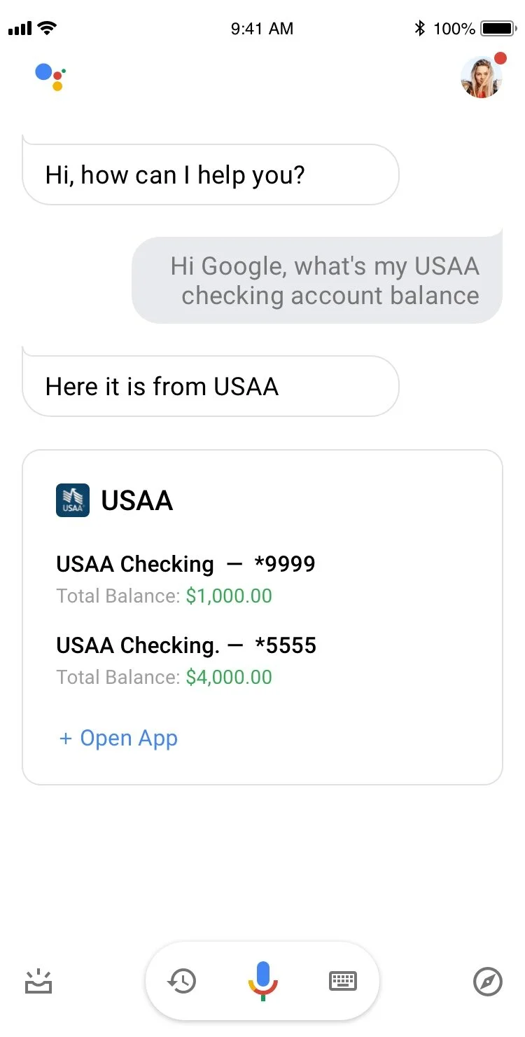
The goal of this initiative was to streamline user access to basic account information, addressing the friction associated with traditional login processes for banking applications. Research indicated that users spend an average of 13 seconds or more entering login credentials. Recognizing that 90% of individuals use mobile banking apps to check balances and 79% to view recent transactions, we aimed to leverage Google Assistant to provide consumers with quick, voice-activated access to read-only account data in under 4 seconds. This approach alleviates the cumbersome login process, offering a more efficient and user-friendly way to access essential information.
Research
My team was assigned to oversee the remaining work for developing a working prototype for the "Off-App" experience effort. A prior team had conducted basic research, and our task was to extract insights from this data to create a prototype for usability testing. Additionally, we prepared technical documentation, delved into UI components, and ensured alignment with our infrastructure and brand guidelines to assist our development partners in building a functional prototype for the pilot.
Low-fidelity
The concept strategy extended beyond UI considerations to encompass a meticulous approach to information architecture. Achieving a minimalistic interface necessitated careful attention to elements like color, font-weight, font-size, and hierarchy. Our exploration delved into determining the optimal number of elements to display on the screen, particularly within the transaction flow.
High-Fidelity
The wireframing process allowed us to solidify the desired user flow. While the developers faced some challenges, they welcomed my honest critiques of any deviations in the working prototype. They valued my input, giving me the authority to approve alternative suggestions. Following my recommendations, they dedicated themselves to replicating the designs precisely as presented.
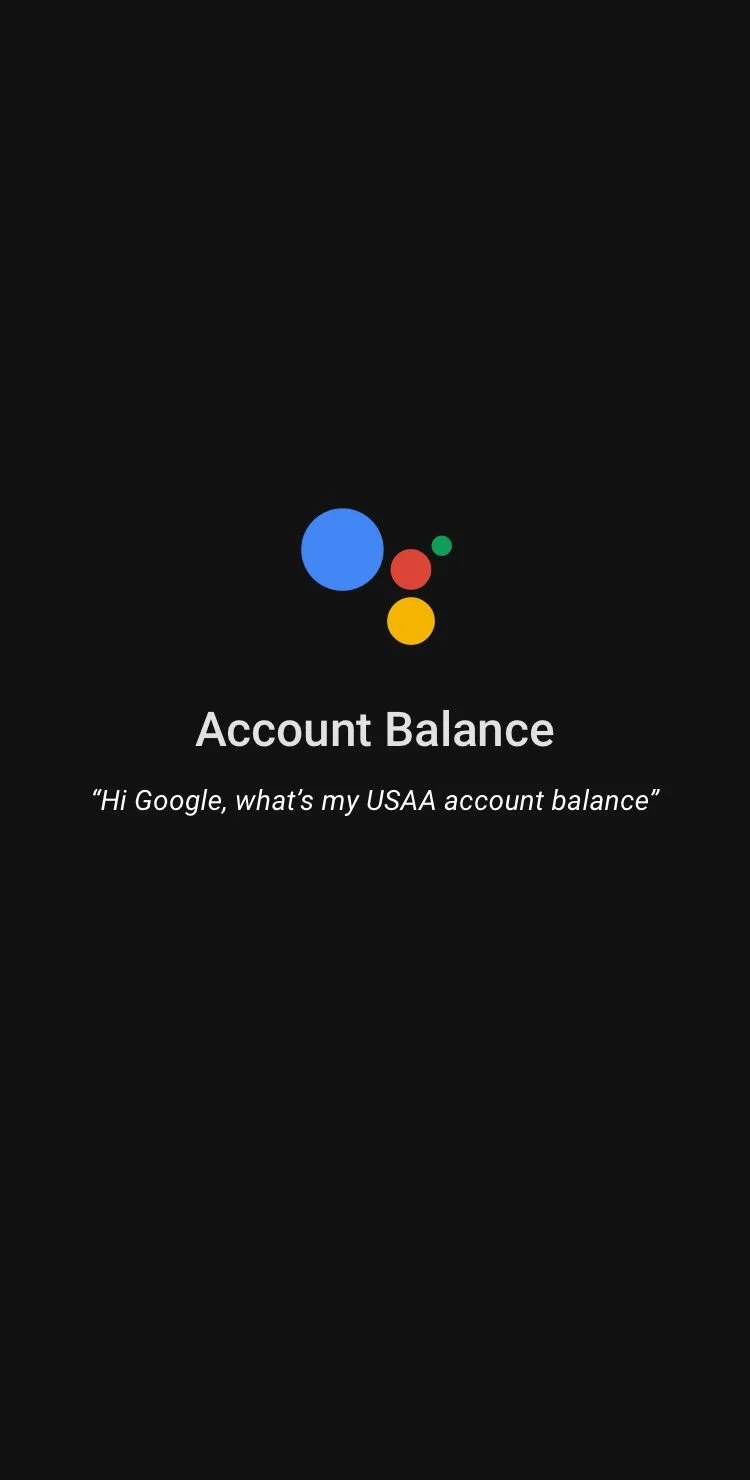
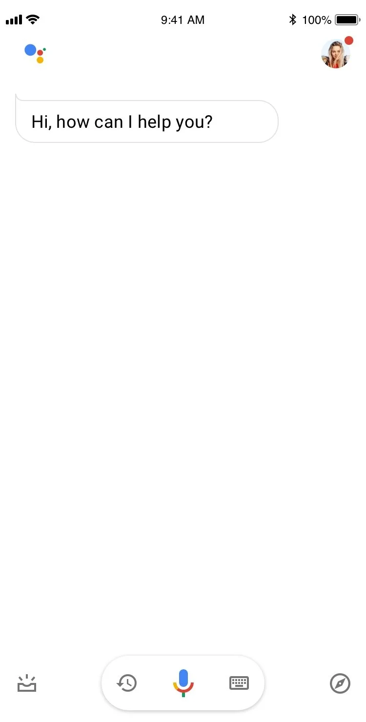
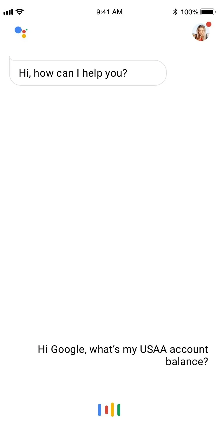
Use Case 1: Account Balance
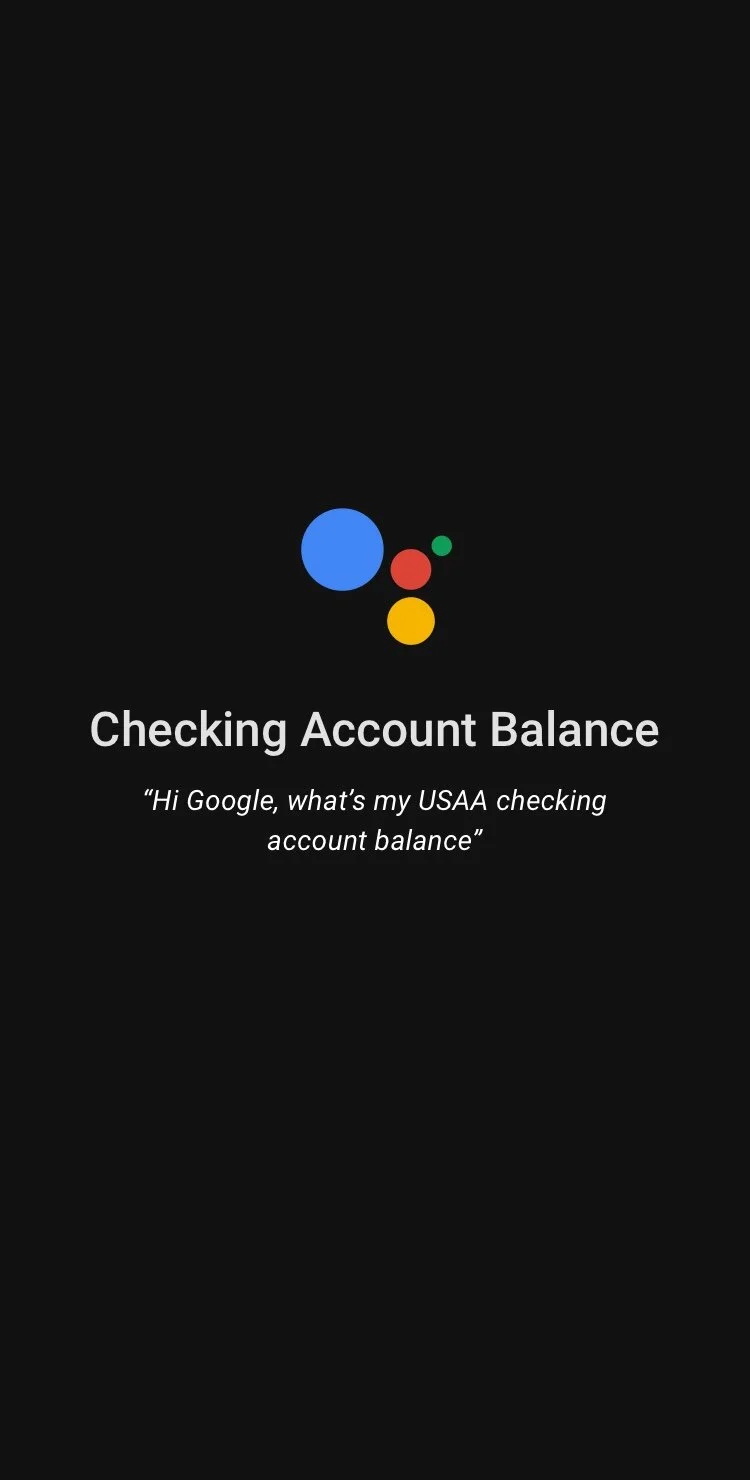
Use Case 2: Checking / savings Balance


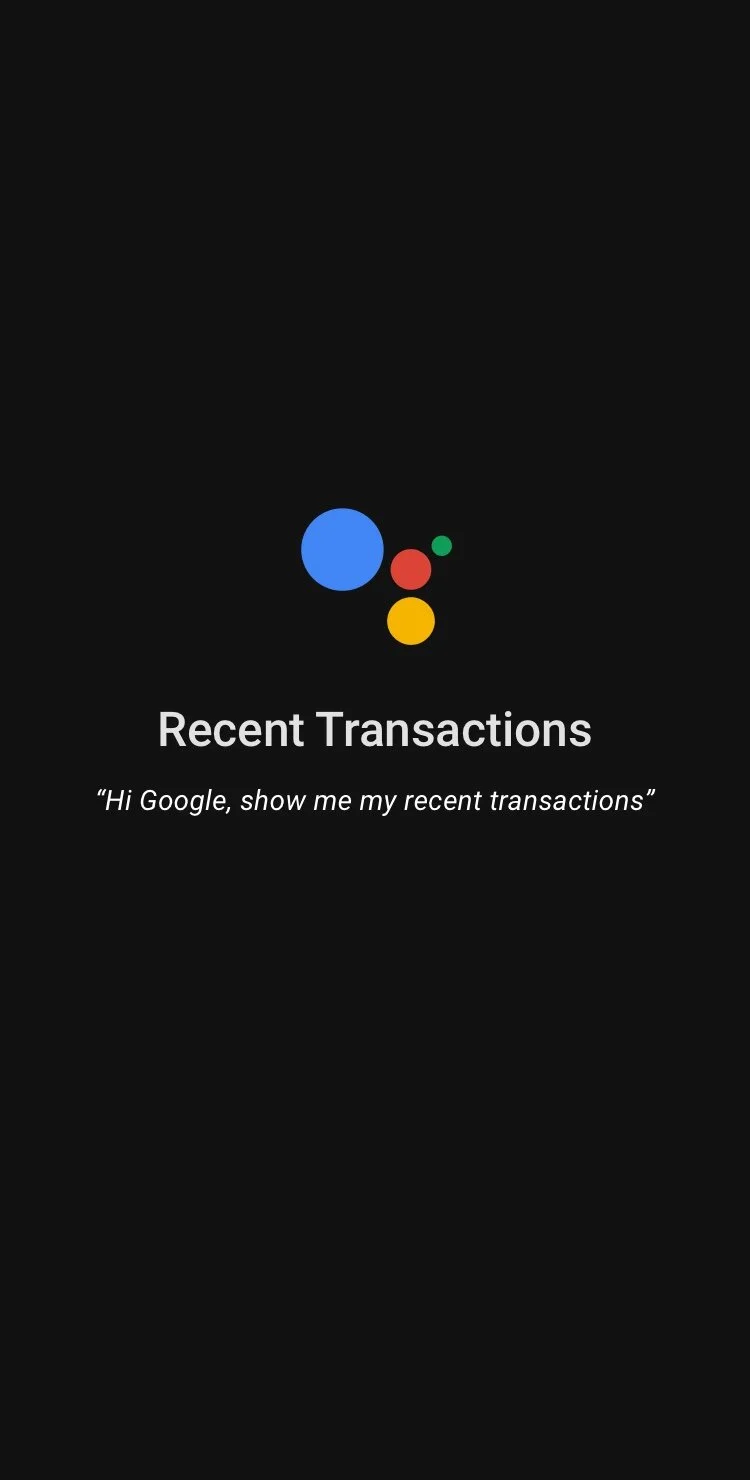
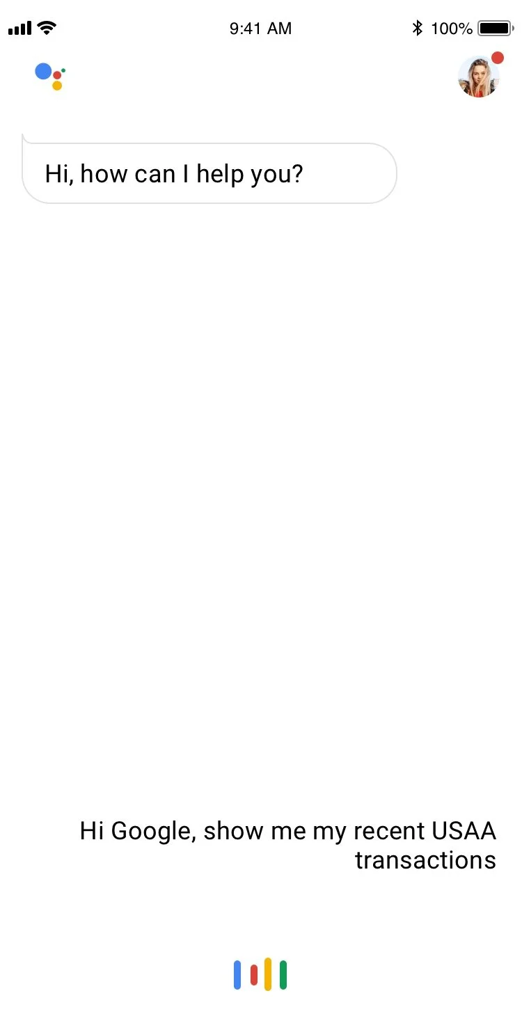
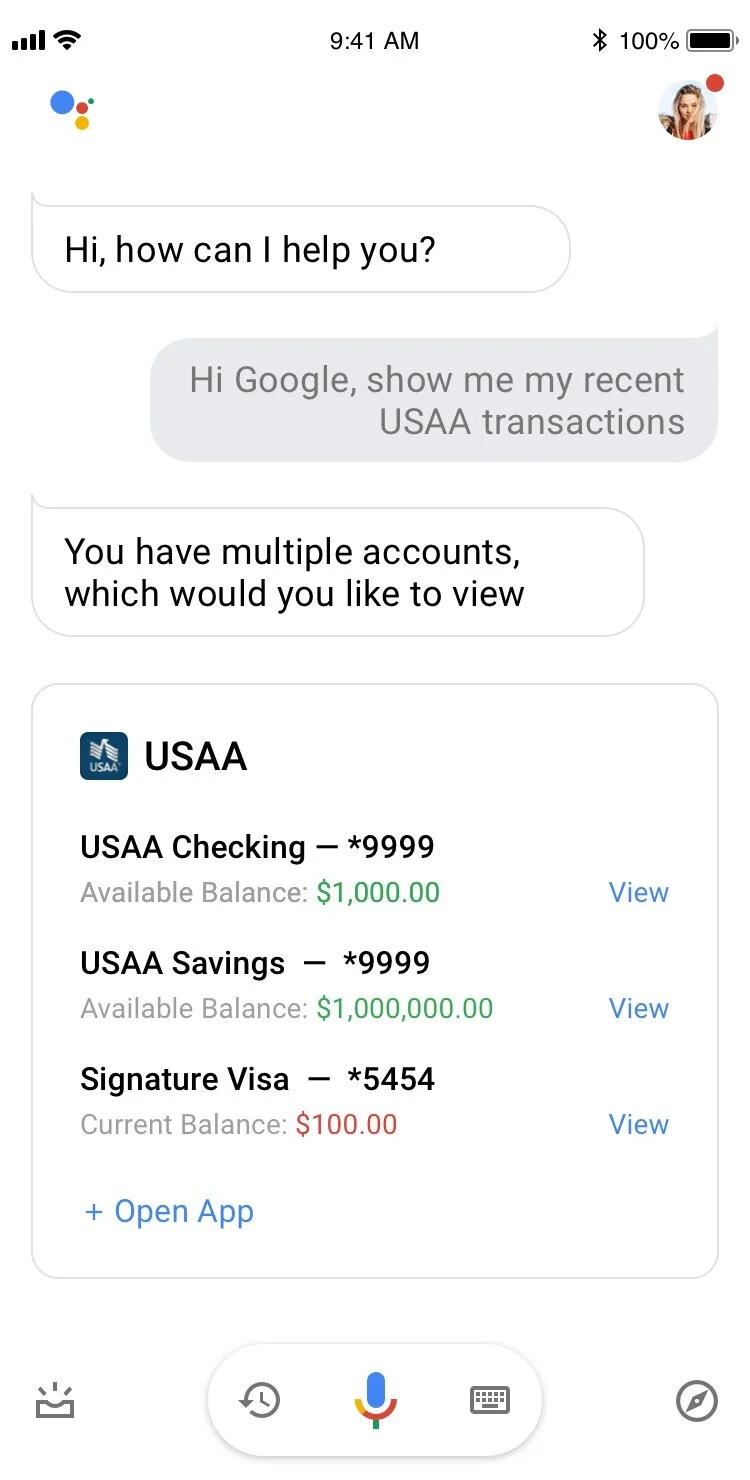
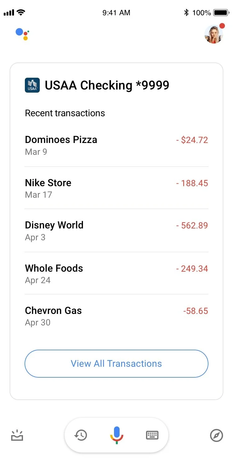
Use Case 3: Recent Transactions